3 Data visualization with ggplot2
Download the songs.csv file from Canvas andfollow these steps:
Save the
songs.csvdataset into yourisys340R/datafolder.Then double click on your
isys3340R.Rprojfile to open your R project.In RStudio, create a new R Madkdown file and save it into your
Rmdfolder.
In your R markdown file, load the tidyverse collection of packages and the dataset songs.csv into a new tibble.
You can make the new tibble d.
library(tidyverse)
d = read_csv("../data/songs.csv")
3.1 Introduction to ggplot
In Section 1.8.3 we have used ggplot to draw some simple plots. In the next paragraphs we will formally show how to use ggplot2 to explore and visualize data.
3.1.1 Syntax
According to the tidyverse website (https://ggplot2.tidyverse.org), ggplot2 is a “system for declaratively creating graphics, based on ‘The Grammar of Graphics.’” The basic idea is that we can provide the data to ggplot2, then tell ggplot2 how to map variables to aesthetics and what graphical components to use, and ggplot2 then takes care of the details.
ggplot2 uses the following syntax:
ggplot(<DATA>, aes(<MAPPINGS>)) + <GEOM_FUNCTION>()
where:
<DATA>represents the input (tibble) dataset.<MAPPINGS>are theaestheticmappings that describe how variables in the data are mapped to visual properties.<GEOM_FUNCTION>is a geometrical object that a plot uses to represent data such as a bar plot, a histogram, a line, and so on.
3.1.2 Summary of functions
ggplot2 provides many geom*(), stat*(), and other customization functions.
A
*in the context ofgeom*means all the available geoms, such asgeom_point().geom_density(), etc. It has its origins in regular expressions, a topic we will explore later in this book.
3.1.2.1 geom*()
In this chapter we will cover the following geoms:
geom_bar(): Creates a bar plot. It takes argument values forsize,color,fill, andalphaattributes. In addition, the parameterpositioncan take the values dodge and stack to create the respective representations.geom_line(): Creates a line graph. It takes argument values forsizeandcolor. In addition, we can customize the type of the line by setting the attributelinetype.geom_smooth(): Creates smoothed trend lines. It takes values for the usualsize,color,fill,alpha, andlinetypeattributes.geom_point(): Creates a scatter plot between two variables. It takes values for the usualsize,color,fill, andalphaattributes.geom_histogram(): Creates a histogram. It takes values for the usualsize,color,fill, andalphaattributes.geom_density(): Creates a distribution. It takes values for the usualsize,color,fill, andalphaattributes.geom_tile(): Creates a heatmap. It takes values for the usualsize,color,fill, andalphaattributes.
linetype options.
3.1.2.2 Customization layers
In addition, we will use the following functions for customizing our plots:
xlab(): Title of the x-axis. Takes as input the title string.ylab(): Title of the y-axis. Takes as input the title string.scale_color_manual(): By setting parametervalues=c(color1,color2,...)it customizes the colors of the plot. By setting parametername=legendTitleit customizes the title of the legend.scale_fill_manual(): By setting parametervalues=c(color1,color2,...)it customizes the color fillings of the plot. By setting parametername=legendTitleit customizes the title of the legend.scale_shape_manual(): By setting parametervalues=c(shape,shape2,...)it customizes the point shapes of the plot. By setting parametername=legendTitleit customizes the title of the legend.theme(): With the optionlegend.position = "top"it customizes the legend to appear at the top of the plot.legend.positionalso takes the valuesleft,right,bottom, andnone.
shape values look here.
3.1.2.3 Themes
We will use custom themes from the library ggthemes.
Note that themes from
ggthemesmight override some of the properties set by the functiontheme()(e.g., the legend’s position).
3.1.2.4 Attributes
Depending on the geom function, attributes can take different meanings:
size: The size of the line or point.color: The outline color of a bar or a distribution; the color of a line.fill: The color that fills a bar or a distribution.alpha: The opacity level (takes values between 0 and 1).linetype: The type of line.
We can map these attributes to a variable of our data inside the aesthetics function mapping:
aes(..., color = VarName). Furthermore, we can set these attributes to a constat value outside thesaes()function but inside a geom():geom_bar(size=2)These two options will yield different results in different contexts.
3.1.2.5 Save to file
We can save our plots to a file of our choice by using the function ggsave(). This function saves files in .png and in .pdf (and many other) formats.
3.2 A bar plot
Take a look at the songs.csv dataset:
d %>% head## # A tibble: 6 × 6
## genre entered_the_cha… twitter_followe… artist_released… label_released_…
## <chr> <dbl> <dbl> <dbl> <dbl>
## 1 Deep House 0 1820 105 304
## 2 House 0 389 89 34
## 3 Trance 1 25141 231 781
## 4 Deep House 0 233 28 91
## 5 Deep House 0 168 104 121
## 6 Progressive House 0 64 642 2963
## # … with 1 more variable: days_after_release <dbl>Assume that we want to explore how the number of songs that enter and do not enter the charts differ between genres. Simply put, we want to examine the heterogeneity of entering and not entering the charts across different genres.
A bas plot can visualize these relationships by presenting side by side (dodge position) the songs that entered and did not enter the charts per genre. This sounds fairly complicated, so we will start with a very simple bar plot that just aggregates the number of songs per genre.
3.2.1 A simple bar plot: Number of songs per genre
Following the syntax:
ggplot(<DATA>, aes(<MAPPINGS>)) + <GEOM_FUNCTION>()
we replace <Data> with our tibble d and <MAPPINGS> by setting our x-axis to the column genre. (This mapping sense because we want to estimate the number of songs per genre). Then, we replace <GEOM_FUNCTION> with geom_bar() since we want to create a bar plot:
ggplot(d, aes(x=genre)) + geom_bar()
3.2.2 Separting songs that entered from those that did not enter the charts
The previous plot does not separate the songs that entered the charts from those that did not enter the charts.
To do so, we need to bind a *separating attribute (e.g., color or fill) to the variable entered_the_charts:
ggplot(d, aes(x=genre, color=entered_the_charts)) + geom_bar()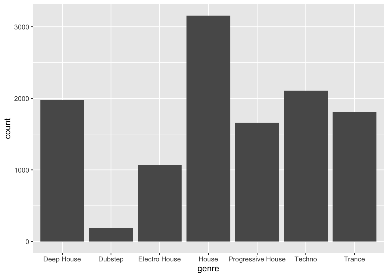
**But… nothing happened. Why?
The reason is that variable entered_the_charts is numeric:
class(d$entered_the_charts)## [1] "numeric"Recall that
tibbleName$columnNamereturns thecolumnNameof the tible. Functionclass()prints out the datatype of the input variable.
For most practical purposes, assuming that the column entered_the_charts is a numeric variable is not an issue. However, for the bar plot, we need to map the column colors to the two different distinct levels of the variable entered_the_charts: One color to the songs that entered the charts, and one color to the songs that did not enter the charts.
In other words, we want to map the two discrete levels of the variable entered_the_charts, and not the continuous space between the two levels that a numeric variable implies.
To do so, we will use the modifier factor() that will transform the variable entered_the_charts into a categorical variable with two levels:
class(factor(d$entered_the_charts))## [1] "factor"By using the factor modifier in the previous plot:
ggplot(d, aes(x=genre, color=factor(entered_the_charts),
              fill=factor(entered_the_charts))) + geom_bar()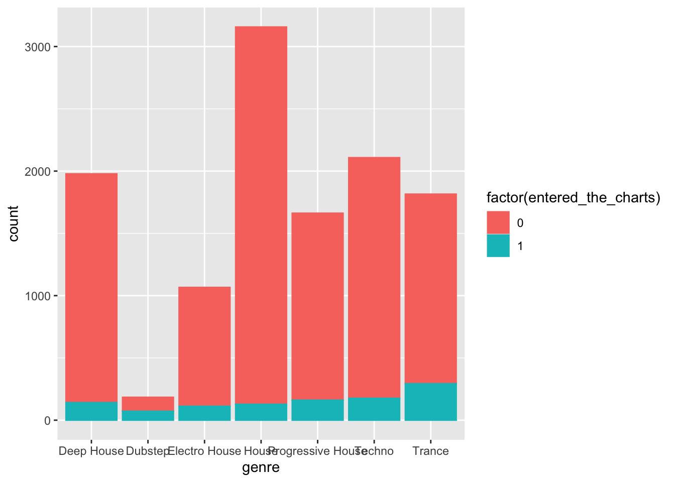
3.2.3 Adding layers for customization
In the next plot we further customize the bar plot as follows:
- Define new colors: maroon, gold, and gray. These are the official Boston College colors.
- Use the functions
scale_color_manual()andscale_fill_manual()(see Section 3.1.2.2). - Update the names of the x and y axis (see Section 3.1.2.2).
- Position the legend on the top of the plot (see Section 3.1.2.2).
Finally, we save this plot into a new object barPlot that we will use next.
maroon = "#8a100b"
gold = "#b29d6c"
gray = "#726158"


legendTitle = "Entered the charts"
barPlot = ggplot(d, aes(x=genre, color=factor(entered_the_charts),
              fill = factor(entered_the_charts))) +
  geom_bar(size=2,alpha=0.7,position = "dodge")+
  scale_color_manual(values = c(maroon,gold), name=legendTitle)+
  scale_fill_manual(values = c(maroon,gold),name=legendTitle)+
  theme(legend.position = "top")+
  xlab("Genre")+ylab("Number of songs")
barPlot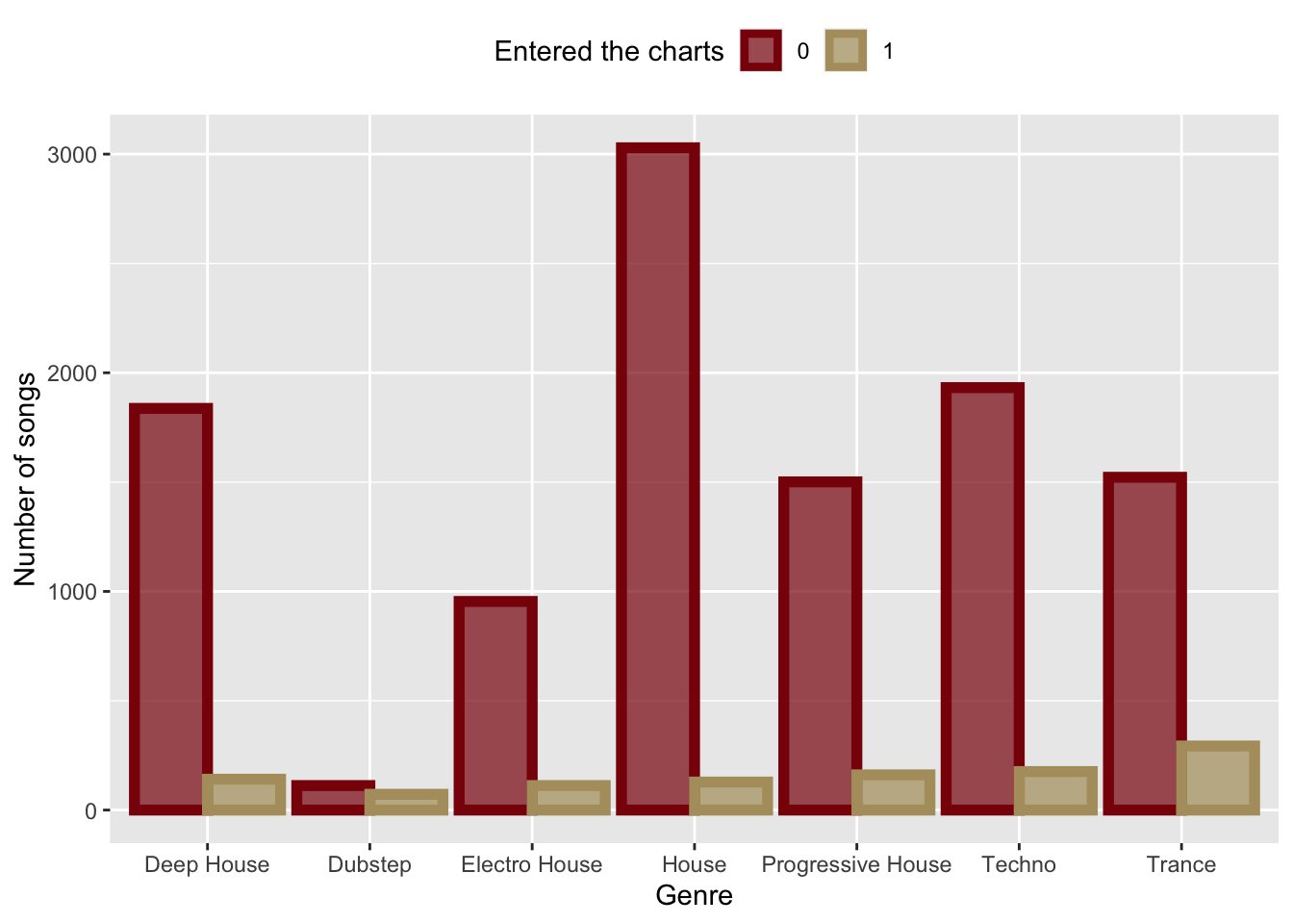
3.2.4 Customizing themes
We can customize the look and feel of our plots with pre-defined themes (see Section 3.1.2.3).
Here is the previous plot, which we saved in variable barPlot, with the economist theme from library ggthemes.
library(ggthemes)
barPlot+theme_economist()+
  xlab("")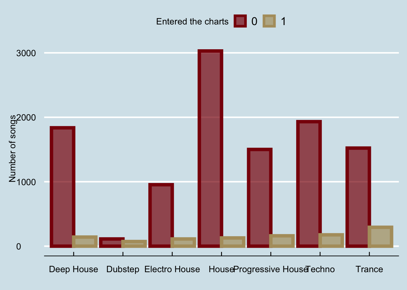
And if we wanted to fix the x-axis to be less crowded:
barPlot+theme_economist()+ xlab("")+
    scale_x_discrete(labels = function(x) str_wrap(x, width = 10))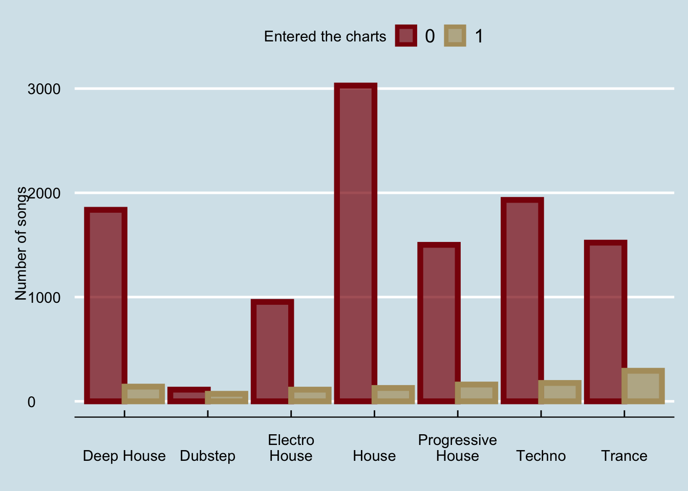
The last part is compoletely optional; for clarity, the function
str_wrap(x,10)wraps textxwhen it is longer than10characters.
3.3 A line graph
What if we wanted to visualize the number of songs that enter the charts over the number of weeks after their release? A line graph would be a good option in this scenario.
First, we will create a new column in the tibble that will store the number of weeks after the release of each song. The new column will store the integer division of the days_after_release over 7:
d = d %>% mutate(week = days_after_release %/% 7 )
d
## # A tibble: 11,970 × 7
## genre entered_the_cha… twitter_followe… artist_released… label_released_…
## <chr> <dbl> <dbl> <dbl> <dbl>
## 1 Deep House 0 1820 105 304
## 2 House 0 389 89 34
## 3 Trance 1 25141 231 781
## 4 Deep House 0 233 28 91
## 5 Deep House 0 168 104 121
## 6 Progressive House 0 64 642 2963
## 7 Deep House 0 604 36 4058
## 8 Progressive House 0 2525271 279 4689
## 9 Deep House 0 275 10 638
## 10 Electro House 0 33 9 107
## # … with 11,960 more rows, and 2 more variables: days_after_release <dbl>,
## # week <dbl>Alternatively, I could add the same column with the $ as follows:
d$week = d$days_after_release %/% 7
d
## # A tibble: 11,970 × 7
## genre entered_the_cha… twitter_followe… artist_released… label_released_…
## <chr> <dbl> <dbl> <dbl> <dbl>
## 1 Deep House 0 1820 105 304
## 2 House 0 389 89 34
## 3 Trance 1 25141 231 781
## 4 Deep House 0 233 28 91
## 5 Deep House 0 168 104 121
## 6 Progressive House 0 64 642 2963
## 7 Deep House 0 604 36 4058
## 8 Progressive House 0 2525271 279 4689
## 9 Deep House 0 275 10 638
## 10 Electro House 0 33 9 107
## # … with 11,960 more rows, and 2 more variables: days_after_release <dbl>,
## # week <dbl>The operator
%/%performs integer division.
Next, we will aggregate the number of songs that enter the charts per week (with the function group_by), and finally, we will use the geom_line() and geom_smooth() functions to plot the linegraph:
t = d %>% group_by(week) %>% summarize(total = sum(entered_the_charts))
ggplot(t,aes(x=week,y=total))+
  geom_line(color=maroon,size=1.5,linetype=2)+
  geom_smooth(color=gold,fill=gold)+xlab("Weeks after release")+
  ylab("Songs that entered the charts")+theme_calc()
## `geom_smooth()` using method = 'loess' and formula 'y ~ x'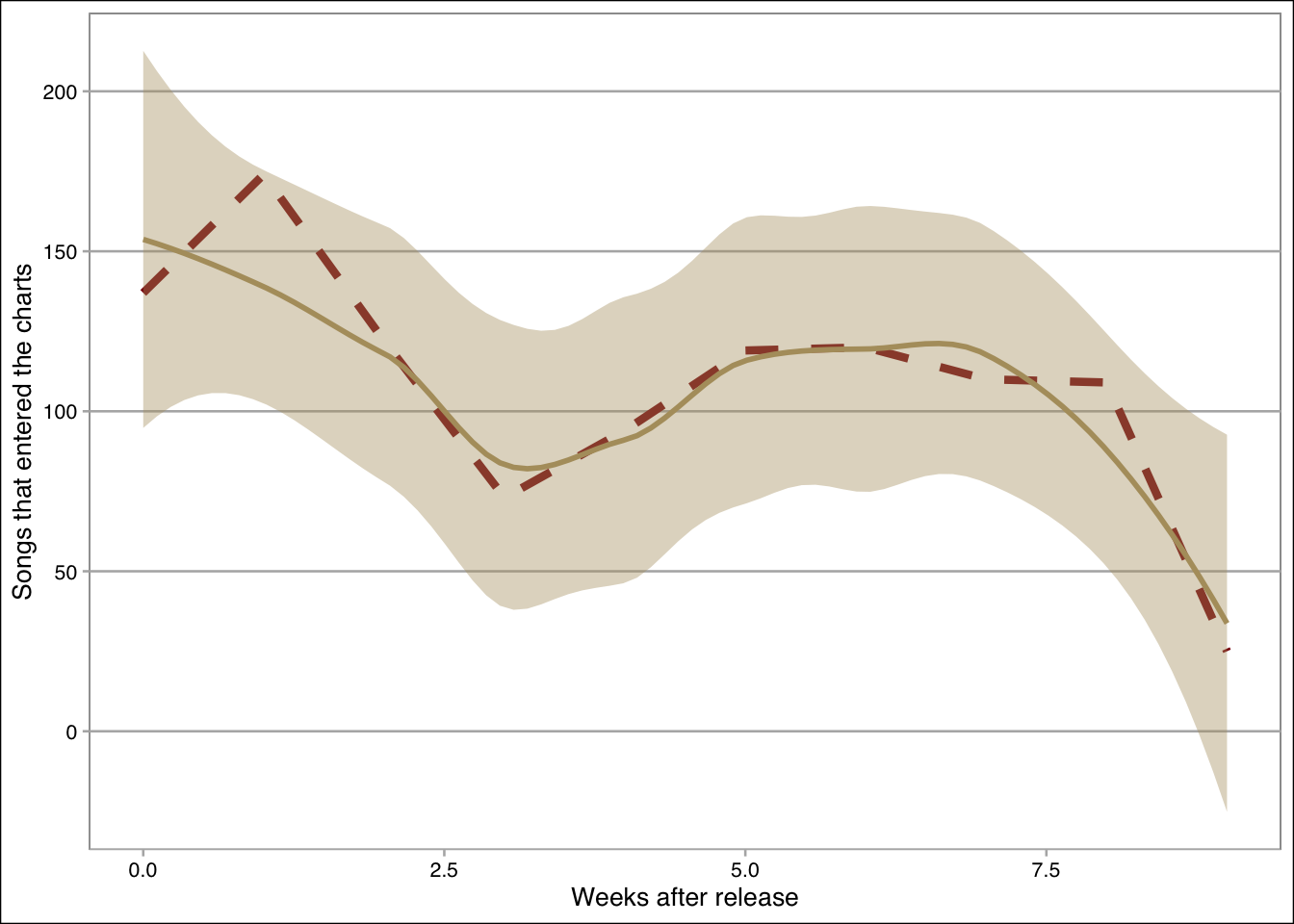
3.4 A scatterplot
What if we wanted to show the relationship between the twitter followers and the number of artists’ releases?
The geom_point() and geom_smooth() functions can do this as follows:
ggplot(d,aes(x=log(twitter_followers), y=log(artist_released_songs)))+
  geom_point(size=0.2,alpha=0.1,color=maroon)+
  geom_smooth(method="lm",color=gold,fill=gold, size=1)+
  xlab("Twitter followers (log)")+ylab("Released songs (log)")+
  theme_clean()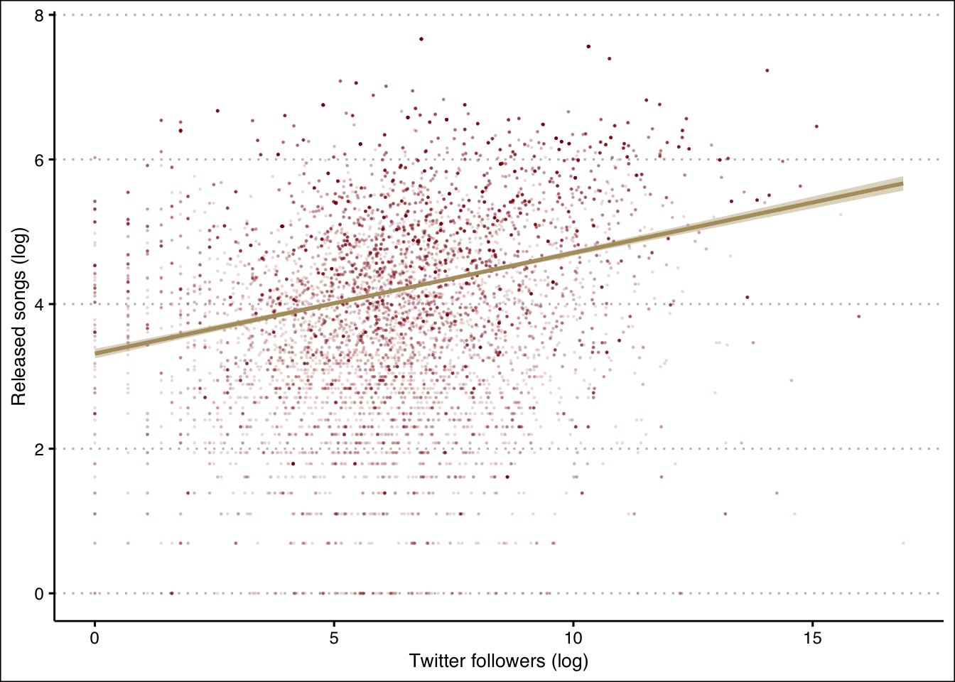
3.5 A scatterplot with three variables
What if we wanted to separate the points in the previous plot according to whether or not they entered the charts?
We can do this by binding the shape attribute to the entered_the_charts variable inside the aesthetics:
ggplot(d,aes(x=log(twitter_followers), y=log(artist_released_songs),
             color = factor(entered_the_charts),
             shape = factor(entered_the_charts)))+geom_point()+
  geom_smooth(method="lm")+
  scale_color_manual(values= c(maroon,gold),name=legendTitle)+
  scale_shape_manual(values= c(0,1),name=legendTitle)+
  theme(legend.position = "top")+ylab("Released songs (log)")+
  xlab("Twitter followers (log)")+
  theme_economist_white()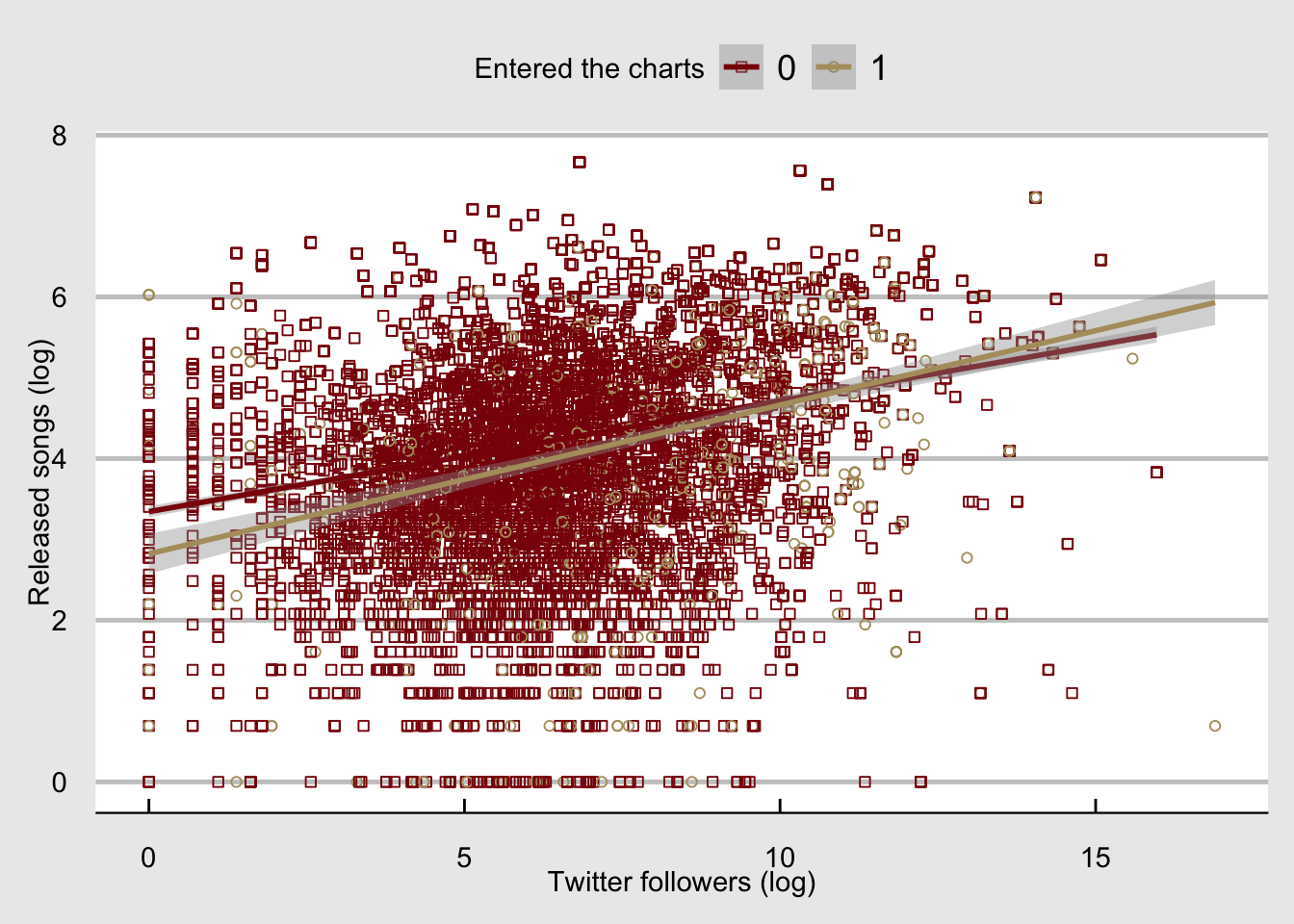
3.6 A distribution plot
What if we wanted to get the distribution of the number of twitter followers? We can call the geom_histogram() or the geom_density() functions.
If we call both, we will need to make sure that the y-axis measures the density by setting y=..density.. (otherwise the distribution outline in this case will be at zero and not around the histogram):
ggplot(d,aes(x=log(twitter_followers), y = ..density..))+
  geom_histogram(alpha=0.7,color=maroon,fill=gold)+
  geom_density(color=maroon, size=1.5)+ylab("Density")+
  xlab("Twitter followers (log)")+
  theme_hc()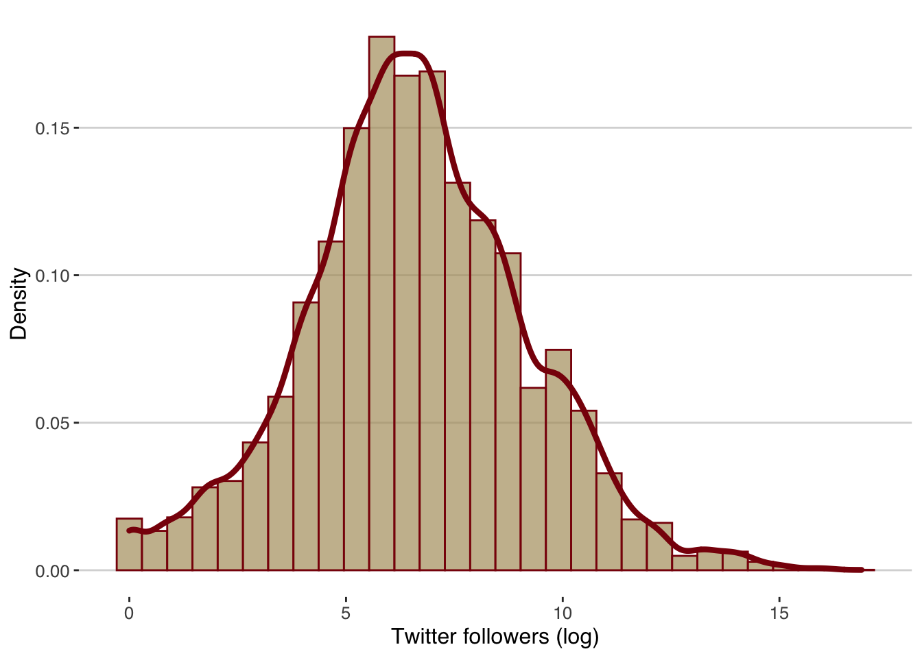
3.7 A heat map
Finally, what if we wanted to visualize three variables, two of which are categorical and the third one shows an aggregated value of the levels of the two categorical variables? For instance, what if we wanted to estimate the average number of twitter followers per genre and entered_the_charts? A heat map is a good way to visualize such relationships, and we can do this by using the geom_tile() function:
t = d %>% group_by(genre,entered_the_charts) %>%
  summarize(mtf =mean(twitter_followers))
## `summarise()` has grouped output by 'genre'. You can override using the `.groups` argument.ggplot(t,aes(x=factor(entered_the_charts), y=genre,
fill=log(mtf)))+geom_tile()+
ylab("")+xlab("Entered the charts")+theme_bw()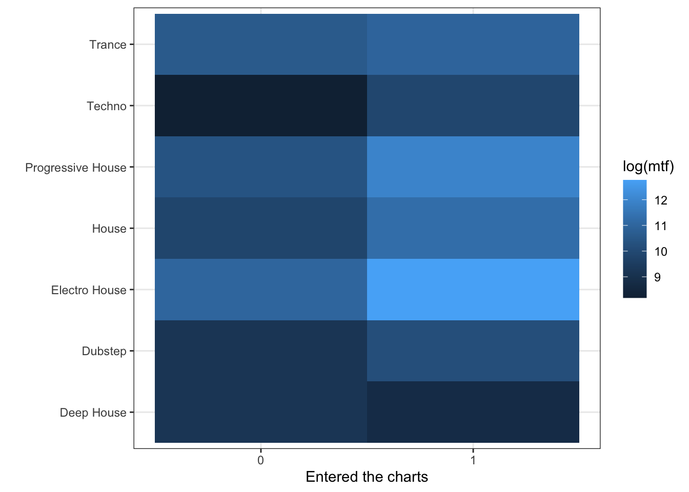
Finally, we can save the heatmap into a directory of our choice. Here I created a directory “figures” inside my R project directory, and I have saved the heatmap into a .png file:
ggsave("../figures/heatmap.png", width = 10, height = 5)For comments, suggestions, errors, and typos, please email me at: kokkodis@bc.edu